Toward Agents with Taste


Written by:
Gourob Podder
Reading Time:
5
min
We’re building agents that generate and edit HTML marketing content for pharma companies: emails, banners, social assets, and more. The challenge isn't just generating valid HTML. The content needs to work within approved claims and brand constraints while still looking considered — tasteful and well-designed.
And then it has to survive the next request: Change the hero, tighten the spacing, or adapt the layout to different copy without breaking the parts that were already right.
Early on, I noticed a frustrating gap. The agent could fix visual bugs when I pointed them out in a follow-up prompt, but struggled to find those same bugs on its own.
I was still doing the “spot the difference” part.
That brought me back to a self-driving car project I built in high school, when I was first learning about computer vision and convolutional neural networks. Some of the ideas I encountered then — especially around tiling, scale, and preserving useful information — turned out to be relevant to a very different problem: What can an agent actually see well enough to reason about?
I’ll focus here on the email path in our HTML-editing agent, particularly when it has a reference design to work from. That gives us a concrete problem to examine:
Can the agent notice where its output differs, make a useful correction, and then verify the correction itself?
1. The setup: Building the self-review loop
The agent works inside a workspace containing the current asset, brand context, approved claims, an image catalog, and, when available, a reference design.
For email generation, it writes MJML, which compiles down to email-compatible HTML. Existing HTML can be edited directly. After making changes, the agent renders the asset in Chromium and receives screenshots it can inspect across desktop, mobile, and dark mode views.
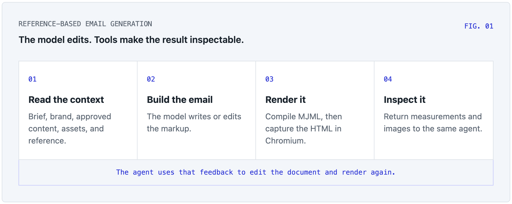
When there’s a reference, it can also compare what it produced with the intended design. The reference can serve two different purposes:
For layout transfer, the agent treats the reference as inspiration, preserving the general structure and proportions while applying a different brand, content set, or visual system.
For a replica, the goal is much stricter. The agent tries to reproduce the reference as closely as the content and brand constraints allow.
The rest of this post is mostly about the second case, where agents create replicas based on a reference.
Some properties are easier to enforce than others. For example, if wording is locked, we can prevent the agent from rewriting it when making styling changes. Cited claim IDs can be checked against the approved library. Structural problems like overflow or broken images can be detected programmatically.
But those checks are deliberately narrow. They protect specific properties; they don't settle whether the layout looks good, or establish complete compliance on their own.
For that, the agent needs visual evidence.
2. Preserving detail in long screenshots
A screenshot doesn't necessarily reach a vision model at its original resolution. It passes through an image processing pipeline with limits on dimensions and total image size.
This creates an easy-to-miss problem for long emails.
Take a 600 × 3,600-pixel email. If the whole image has to fit within a roughly 1,500-pixel long edge, its width shrinks to around 250 pixels.
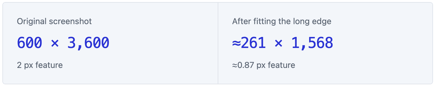
At that point, a two-pixel border is no longer really two pixels — it occupies less than one pixel. A subtle shadow becomes a few blended values around a tiny component.
You can still recognize the page, but you've lost some of the evidence needed to judge it.
We saw this clearly with shadows. They were difficult to reproduce accurately, and sometimes the agent missed the mismatch entirely. Soft shadows are especially awkward because the feature you care about is mostly a low-contrast transition in the background surrounding the component.
Our solution was to stop using the full screenshot as the only unit of visual evidence.
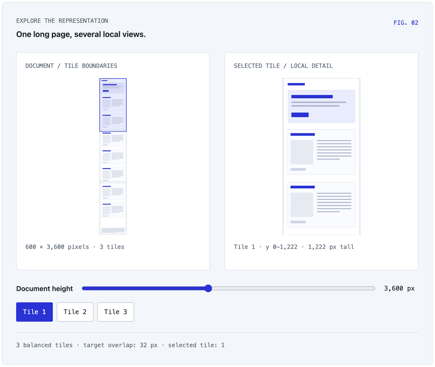
Our renderer still captures the entire page, but long documents can also be divided into overlapping vertical tiles. We balance the tile heights rather than chopping at fixed intervals, which avoids ending up with a mostly useless final strip. Each tile retains its position in document coordinates.
The agent therefore gets two kinds of views:
A full-page view to see global composition and structure
Higher-resolution regional views for local detail
When those still aren't enough, it can request a tighter crop at higher scale. The overlap between tiles preserves some context at the seams, but it doesn't guarantee that every component lands inside one tile, which is why targeted crops still matter.
This was the first place my old computer-vision intuition became useful again: Control the scale and coverage of the evidence.
A full-page view helps with composition.
A local view helps with details.
Those aren't the same visual task, so we stopped giving the agent the same representation for both.
3. Alignment before comparison
Once we had better local views, we encountered another problem: Corresponding coordinates don’t necessarily contain corresponding content.
Suppose a call to action starts at y = 1,200 in the reference but y = 1,050 in the agent's render because the sections above it are slightly shorter.
Crop both pages at y = 1,200 and you may be comparing a button in one image with body copy in another.
Our verifier handles alignment in stages:
Find rough horizontal regions. We look for runs of nearly uniform rows that can separate the document into broad horizontal content bands. Importantly, these aren't semantic labels like "hero" or "footer." They're geometric regions inferred from the rendered image.
Match the regions in order. We use sequence alignment to pair bands between the reference and the render. The cost incorporates blurred pixel differences, along with relative position and height, while allowing a band to remain unmatched rather than forcing an obviously bad pair.
Refine the crop locally. Once a component lands in roughly the right region, we search locally using luminance-gradient profiles — patterns in how brightness changes vertically — to line up useful features such as component edges and text lines.
The DOM supplies another source of evidence. From the rendered page, we can identify candidate regions around components such as cards, buttons, and images. Those regions can then be mapped into the reference and returned as crop pairs.
Both crops use a shared zoom, an important detail that's easy to overlook. If you independently scale two crops to fill the same box, a component that is physically too large in the render can suddenly appear identical to the reference.
The comparison system itself has "corrected" the defect before the model gets a chance to see it.
But alignment isn't perfectly solvable; there are limits to this approach. Dense pages may have no useful horizontal gaps. Two visually similar documents can split the same content into different bands. Text reflow can shift everything below it.
When alignment becomes unreliable, we'd rather fall back to a weaker comparison than manufacture precision. Otherwise, a small alignment error can turn into very confident feedback about the wrong thing.
4. Turning visual differences into actionable feedback
Our fidelity verifier prepares measurements, chooses regions worth inspecting, and returns labeled images to the agent doing the work. It doesn't decide itself whether a design looks right.
There are useful deterministic measurements we can make, but what's measurable depends on what kind of reference we have:
Reference | Available evidence |
|---|---|
HTML | Computed styles and geometry: typography, borders, corner radii, shadows, and dimensions |
Image | Pixels: document height, sufficiently reliable section geometry, large visual differences, aligned regions, and detailed crops for the model to inspect |
An HTML reference lets us compare properties directly; an image reference doesn't. If the shadow looks wrong, the model still has to look at it and decide how it's wrong.
So we stopped asking questions like, "Does this match the reference?"
That collapses a fairly rich visual judgment into a binary answer.
Instead, we give the agent a specific comparison routine: describe the relevant property in the reference first, then describe the render using the same properties, then only then compare them.
For a shadow:
Is the shadow present?
Is it lighter, darker, softer, or harder?
Does it reach as far?
How does that compare with the reference?
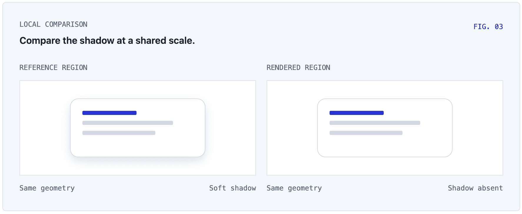
The protocol asks for relative verdicts: “slightly less,” “equal,” or “slightly more.” That gives the next edit a direction. “Improved” doesn't.
We also don't input every possible difference into the context at once. Candidate regions are ranked so the model can inspect a small number of mismatches in detail, while overlapping or redundant regions lose priority. That means each verifier call samples the page, and a clean pass is evidence — not proof — that every visual detail is correct.
Changing the underlying model also improved the agent's ability to catch subtle differences like shadows. But the model, tiling strategy, alignment, and review protocol all improved together, so I can’t cleanly assign the improvement to just one change.
What became clear in practice was that model choice and the way we presented visual evidence both mattered.
5. Defining "done"
Pixel comparison creates another problem: Some differences aren't design defects at all.
Font antialiasing varies, image recompression can change pixels, and browser rendering can produce small, pixel-level differences, even when two layouts are visually indistinguishable.
If you ask an agent to drive the pixel difference to zero, it can spend an enormous amount of effort without improving the design.
That's why deterministic findings use tolerances; a measurement has to differ enough to be actionable before it should be treated as a defect.
Total document height is a good example. Exact equality is a weak proxy for visual fidelity — two pages can have the same height and completely different section proportions. The current height check allows the larger of 72 pixels or 4% of the reference height before flagging a difference. That is a practical threshold in this implementation, not a definition of visual quality. It answers the question, "Is this difference large enough that the agent should spend time on it?" — not, "Is the design objectively correct?"
Checks also need to stay attached to the version that was inspected. If the agent changes the HTML, the earlier check no longer counts as a check of the current asset. We bind verification to the inspected content so an edit invalidates the previous check.
Finally, the loop needs a budget. In the HTML-edit replica path, the completion check can trigger one automatic follow-up, capped at 20 steps. Even when measurements are clean, that follow-up can ask the same agent to review the work again as an outside reviewer would. But it can't recurse forever. The budget gives the process an endpoint; it doesn’t guarantee a perfect result.
6. Where we are now: From fidelity to taste
The agent now runs the asset-generation loop end-to-end without me guiding each step. I still make follow-up edits after it produces the asset, but the full generation loop is much faster than it was at the beginning.
That’s an observation from using the system rather than a measured speedup or a controlled comparison of these techniques.
The improvement I care about is practical: the agent can do more of the inspection and revision inside the generation loop.
And reference fidelity is only one part of what we mean by “design":
Matching an existing reference gives the system a target
Choosing the right image is different
Adapting a layout to a different amount of copy is different
Composing something new is different again
These problems move us away from visual fidelity and toward the much harder question of taste.
The useful improvement so far is that the agent can participate in reviewing its own work instead of waiting for a human to identify every defect first. And building that changed how I think about agents.
It's tempting to focus almost entirely on action: What tools can the agent call? What files can it edit? What can it generate?
But an agent that can act in the world also needs a good representation of the consequences of those actions. For visual work, the images and feedback we give the agent are part of the design of the agent itself. It needs a good view of its work, a useful way to compare, and a chance to make another pass.
If we want agents with taste, we have to engineer what they see — not just what they can change.